The Future is Frictionless: Building Effortless Brand Experiences
As anyone who’s been for a long cycle with no chamois cream knows, friction is uncomfortable.
Whether it's recommendations, retention or revenue, a frustrating customer experience can reduce them all.
Busy lives mean buyers don’t have the time to ring up companies to ask about their orders or resolve problems with their services. Plus, with so much market choice available, as soon as someone has a bad experience (no matter how minor) they can switch brands.
From the first click to the last mile, achieving complete simplicity in systems, processes, and customer experience has become the new standard. Having an ‘easy like Sunday morning’ brand can also help, and doesn’t mean you have to be soulless, boring or lack impact.
Why customers want simplicity
Whether it’s getting answers to questions, actually purchasing products or accessing extra support, customers want their needs fulfilled with minimal input, delays or disruption. It doesn’t really get more complicated than that, here’s why:
- Higher mental load: both at home and work, customers are bombarded by content and information. This can lead to overwhelm and mean they automatically tune out any complexities.
- Fast-paced lives: busy schedules mean buyers are time poor, so they need to be able to conduct research, gather information, make decisions and purchases, then use services or products efficiently.
- Increased scepticism: although first and foremost customers want their practical needs met, the ‘vibes’ are still important. As the online world has grown, so has buyer scepticism. Trusted brands can more easily overcome this hump.
What does brand simplicity look like?
To meet customers’ needs for simplicity, great brands are effortless, both in their looks and functionality. Unfortunately, this isn’t as straightforward as switching to minimalist logos or neutral colours. It’s about making every customer interaction feel intuitive, useful and uncluttered. Any excess, fuss or complications aren’t welcome in simple brands.
Hallmarks of brand simplicity include:
- A visual identity that’s accessible, with easy-to-read typography, minimalist graphics and paired-back colour schemes.
- Using straightforward language in a tone of voice that’s clear and personable, this should be used consistently across all communications.
- Intuitive UX or UI across digital channels, making it easy for customers to self-serve information, purchase products or services and get help.
- Backend systems which use technologies such as smart automation to make processes efficient, personalised and straightforward.
- Brand architectures that clearly distinguish any sub-brands, products or services while also making them distinctively ‘yours’.
Depending on your brand maturity, achieving simplicity may require a complete marketing overhaul or a process of continuous improvement. However, developing an effortless brand without fixing your customer experience could undermine your efforts. Brand simplicity needs to be a wholesale effort to truly be effective.
Effortless examples
Ok, so what does simplicity actually look like? Here are some worst and best practice examples.
Skincare: Kiehls vs Typology
As soon as you land on Kiehl's homepage, you’re bombarded by products, discount offers and messaging - creating a visual confusion
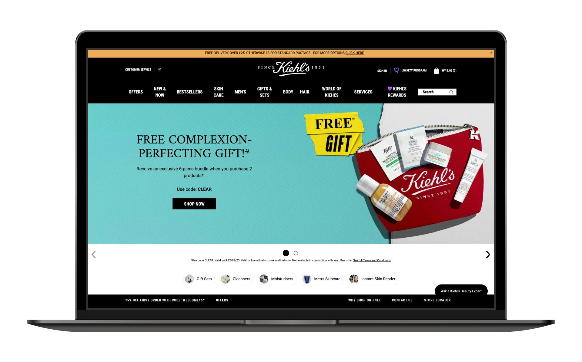
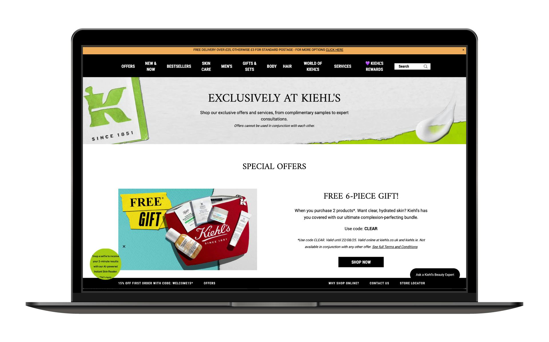
The brand's website has so many buttons to press, small graphics to look at and captions to read - with an inconsistent use of typography - that visitors have no clear direction. If they want a specific product or to fulfil a need, they website is forcing the user to have to think and potentially make several clicks before they even get close to their buying-decision.
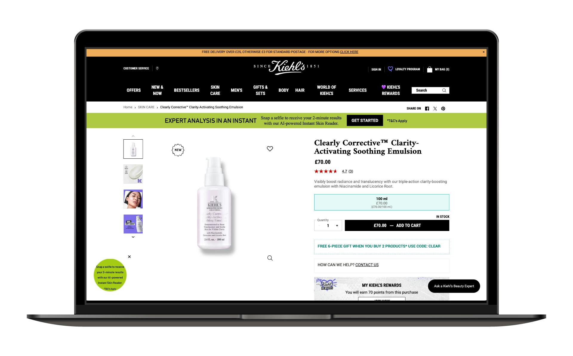
Even when the customer reaches the product destination, the experience feels overwhelmed with action points and additional feature prompts.
In contrast, Typology’s homepage makes their offering clear from the get-go with a straightforward, needs-focused headline and subheader. Their USPs are summed up in five words before visitors can scroll down to see their best-selling products or try their easy-to-use product selector tool to find exactly what they want.
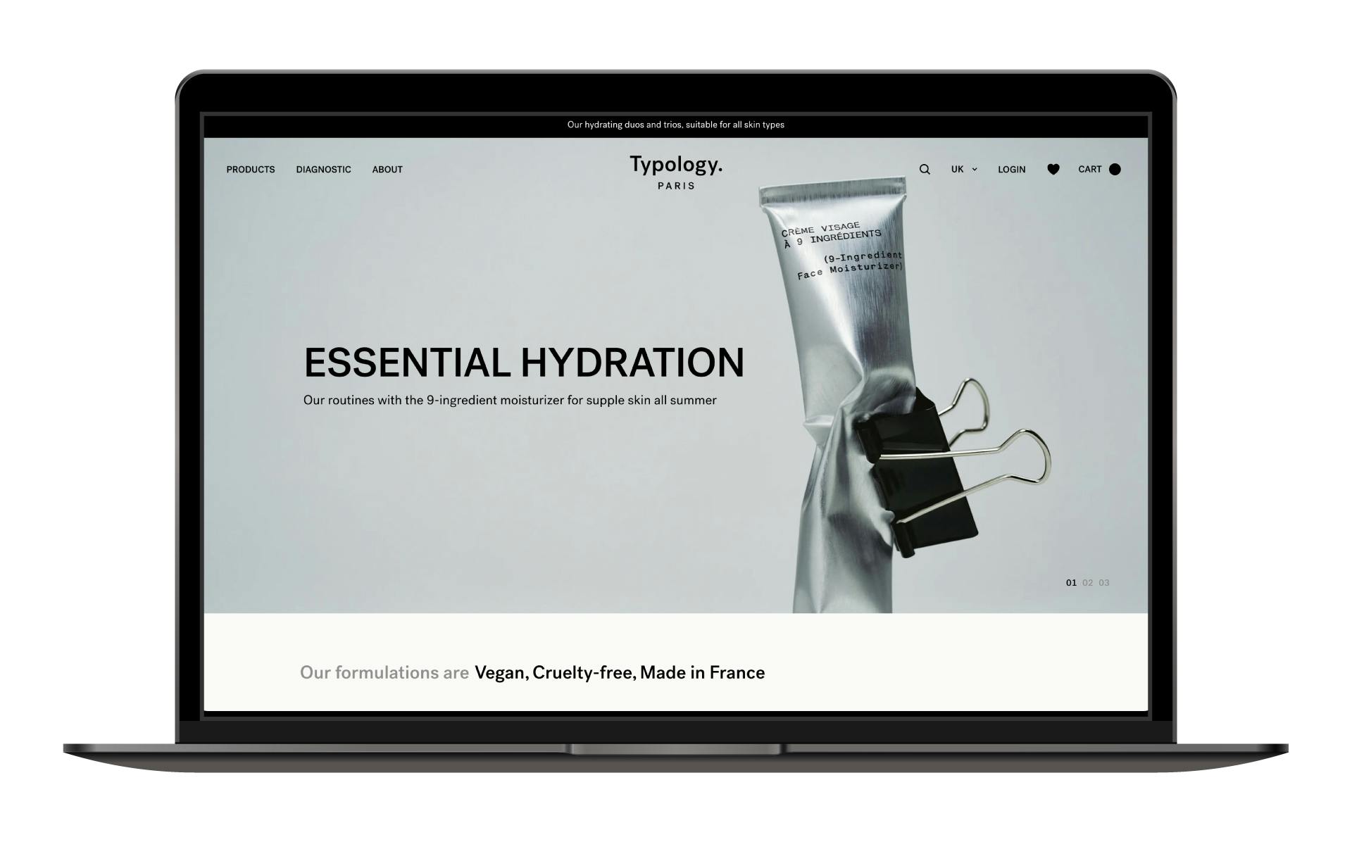
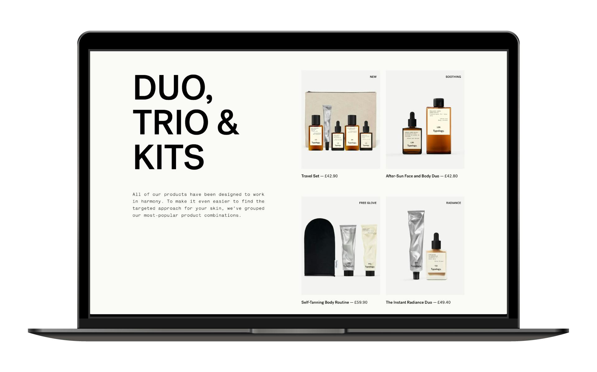
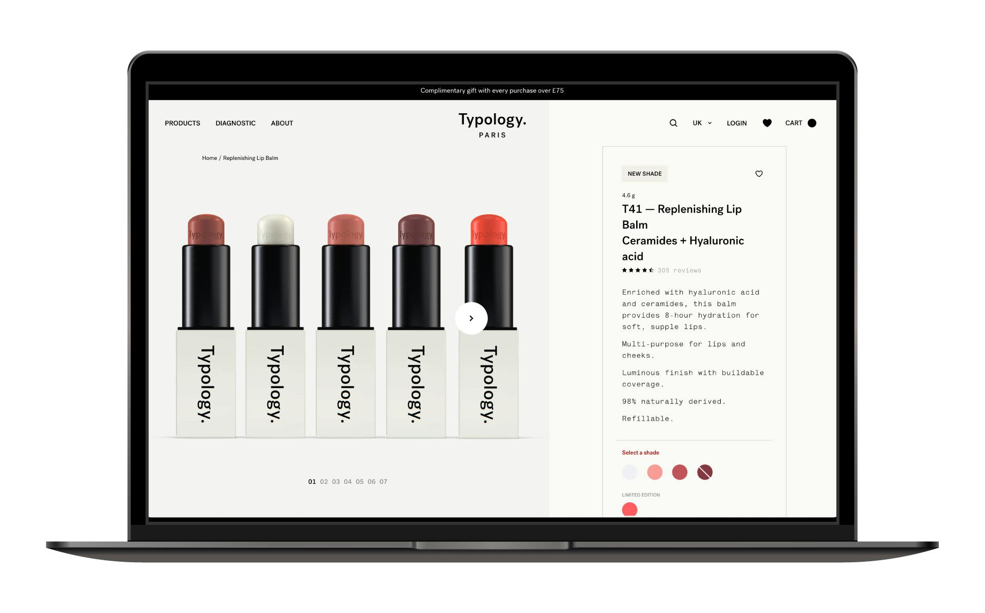
With the brands simple, clear and stylishly intuitive design, the customers experience is easy and exact. Then, when the user reaches their destination point of the website, the product information is presented cleanly, providing the user with an experience that feels calm - which in turn increases the likelihood of them completing the purchase process.
These two brands don’t just offer totally different user experiences, they present two totally different brand tones. While Kiehl’s website presents a brand that feels old-fashioned and price-based, Typology is modern, dynamic and needs-focused, which is much more appealing to the modern customer.
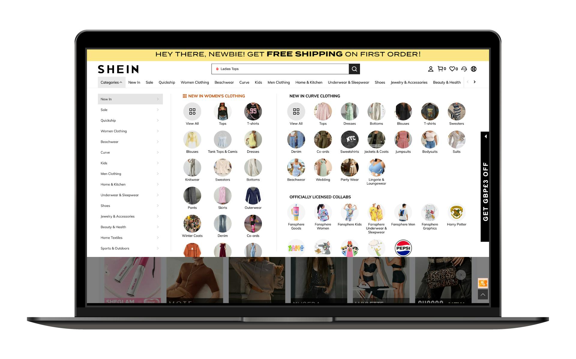
Fashion: Shein vs Cos
The only thing outnumbering pictures on the Shein website are pop-ups (cue click-closing overwhelm). Do you want to look at ‘Top Trends’, ‘Super Deals’ or see a specific product range? Well you’ve got them all on one page.
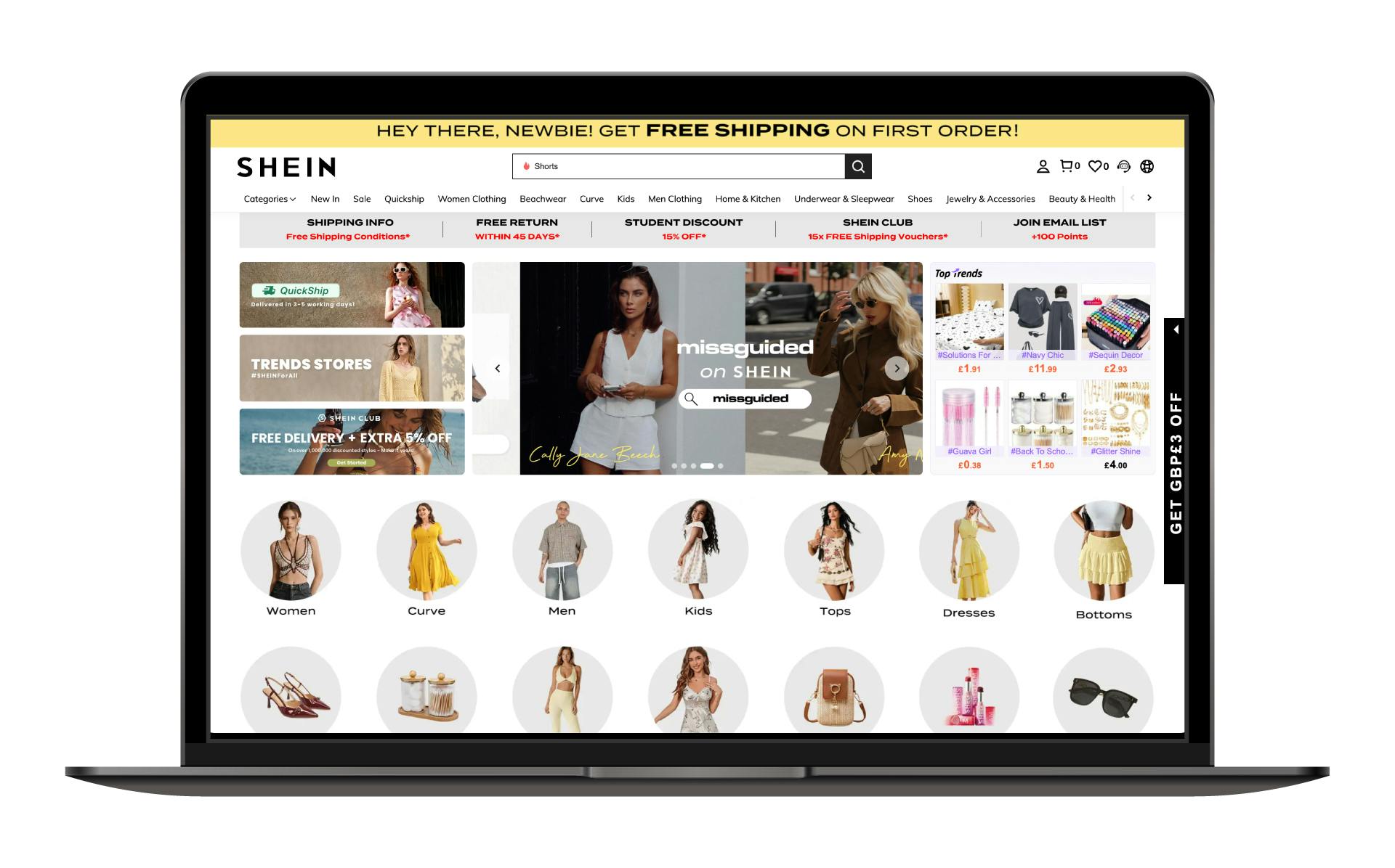
The brand's overuse of photography throughout the website (including within the site menu), gives off a feel of shouting ‘discount brand’ and a user experience that’s all about selling, not the enjoyment of perusing shopping.
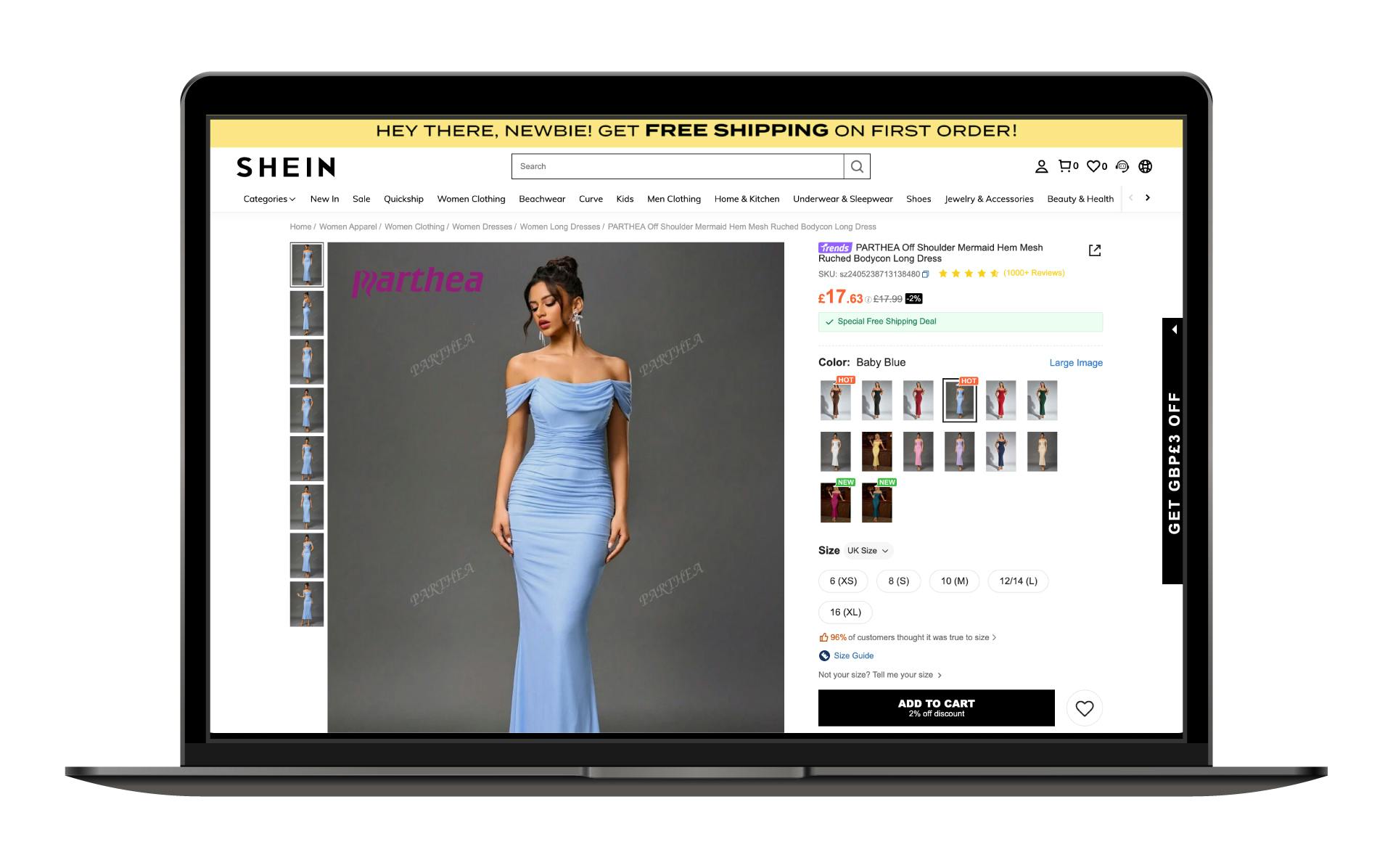
By the time the customer reaches the point of purchase, the website still fails to provide a clear, simple interface. Instead of guiding them seamlessly, it overwhelms with cluttered visuals and excessive information, increasing the risk of distraction.
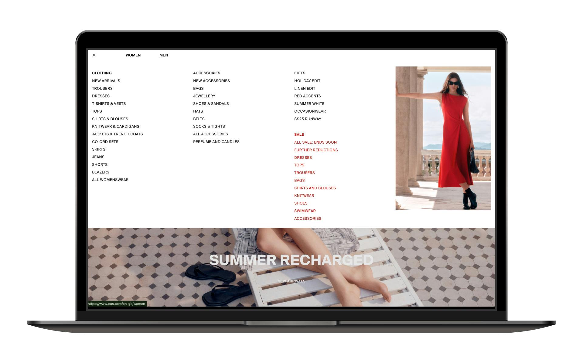
Alternatively, clicking on the COS website feels like a sigh of relief. A single, quality photograph sets the background for a simple caption, navigation and one subtle pop-up box.
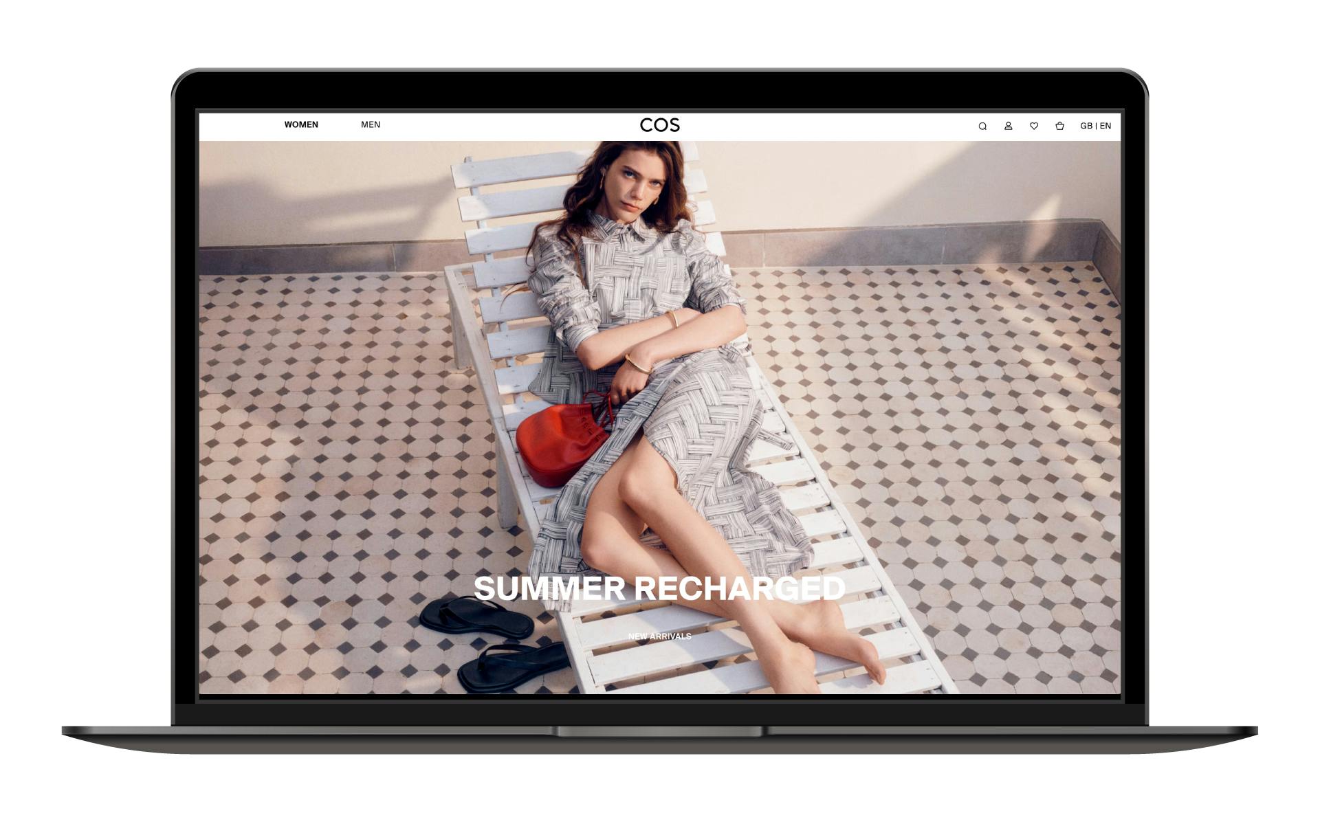
The sense of space given by subtly placed caption text and a simple colour palette, leaves visitors to browse at their own pace (just as they would in a shop) without being harangued by ‘buy now’ buttons.
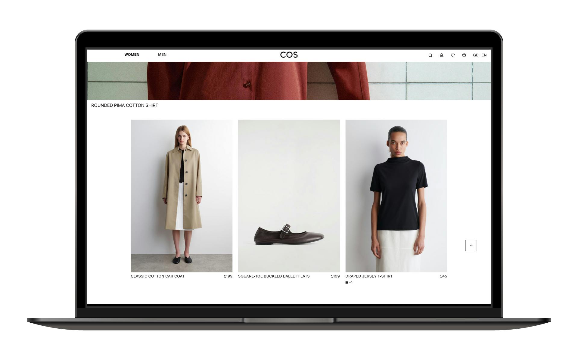
The main menu of the website - though equally as extensive as its Shein counterpart - is presented as a typographic list solution, ensuring that the user can explore the full range of products with ease and without obstruction.
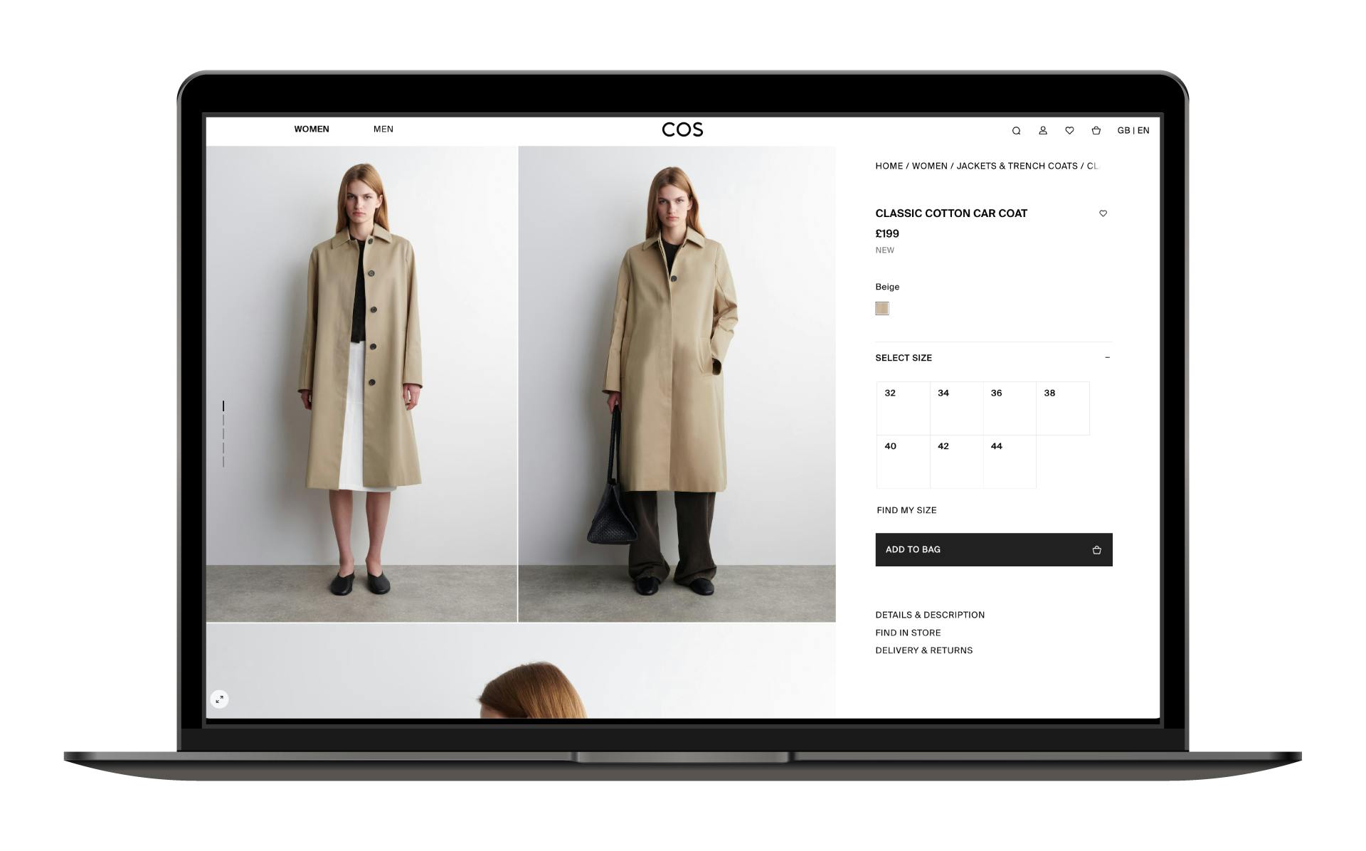
At the point of purchase, the customer is met with a bold, minimalist interface that streamlines decision-making. Only the key, decision-driving details are shown upfront, with the option to explore more if desired – creating a smooth and focused buying journey.
Automotive: Jeep vs Polestar
When you first land on the Jeep website it feels like stepping back into the ’90s.
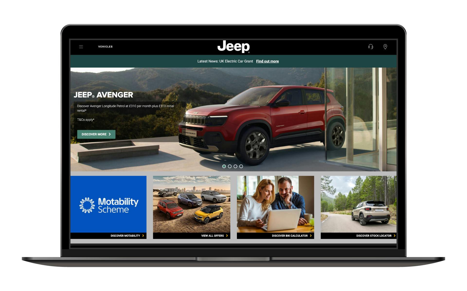
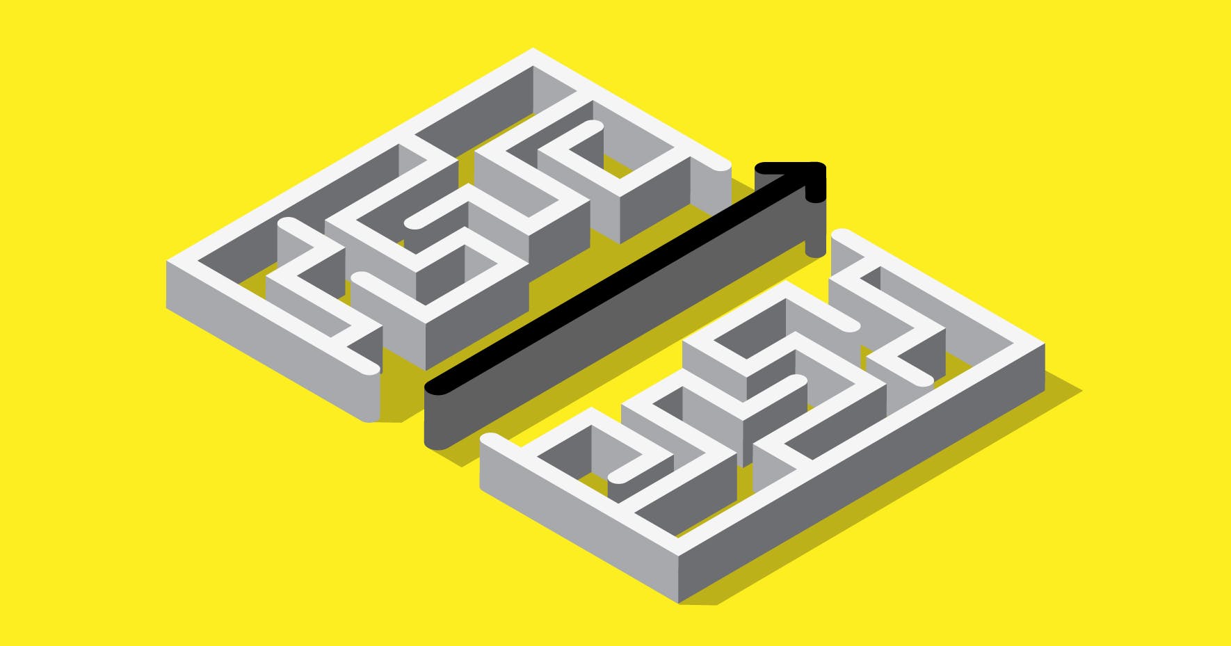
Then, as a customer, you try to navigate to a product page – if you can find your way through the maze-like menu – and you’re immediately hit with four pricing options, three next steps, and four different engine types to choose from.
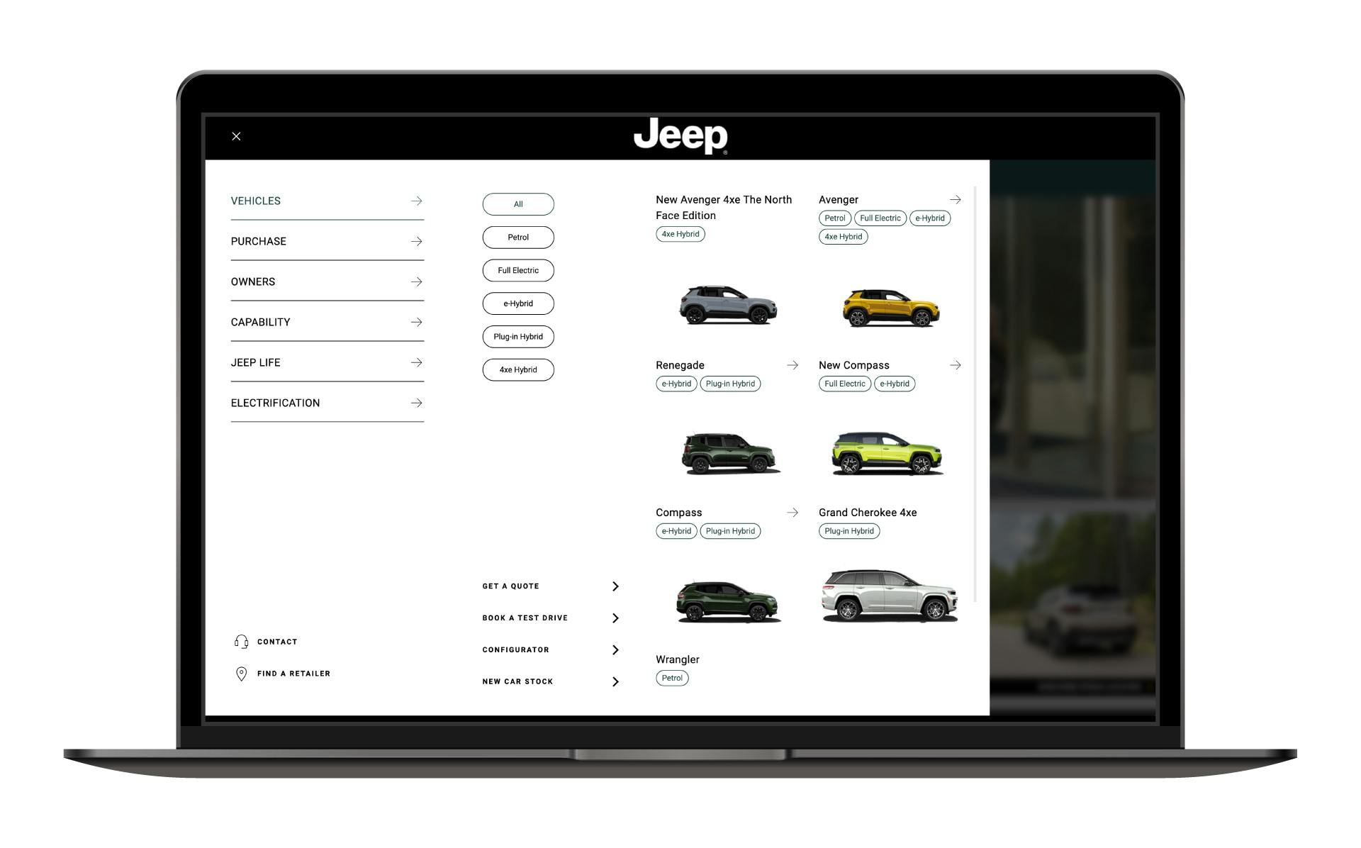
That’s before you get to the ‘distinguishing features’ and lengthy product descriptions. Want to weigh up the different specs and prices? Well, you’ll have to download a PDF guide and do it manually.
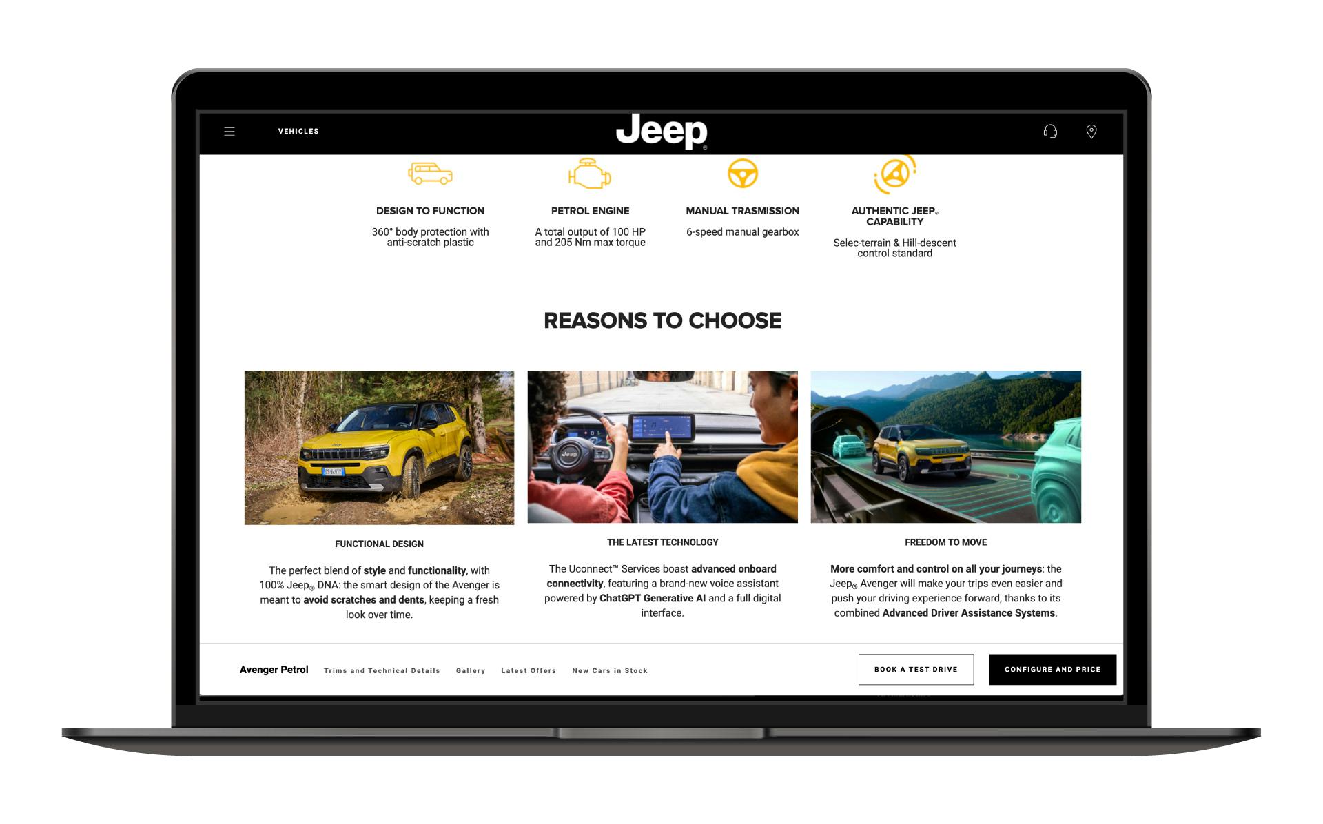
For a brand as established and modern as Jeep, the online customer experience feels surprisingly dated, rigid, and lacking in inspiration - hardly the impression you’d expect from a product built on lifestyle and aspiration.
In stark comparison, in just a couple of clicks, you could be viewing a Polestar vehicle, its top-line stats and pricing information, plus USPs. All delivered using exciting (autoplay, not manual like Jeep) videos and photography alongside a few bullet points and short captions.
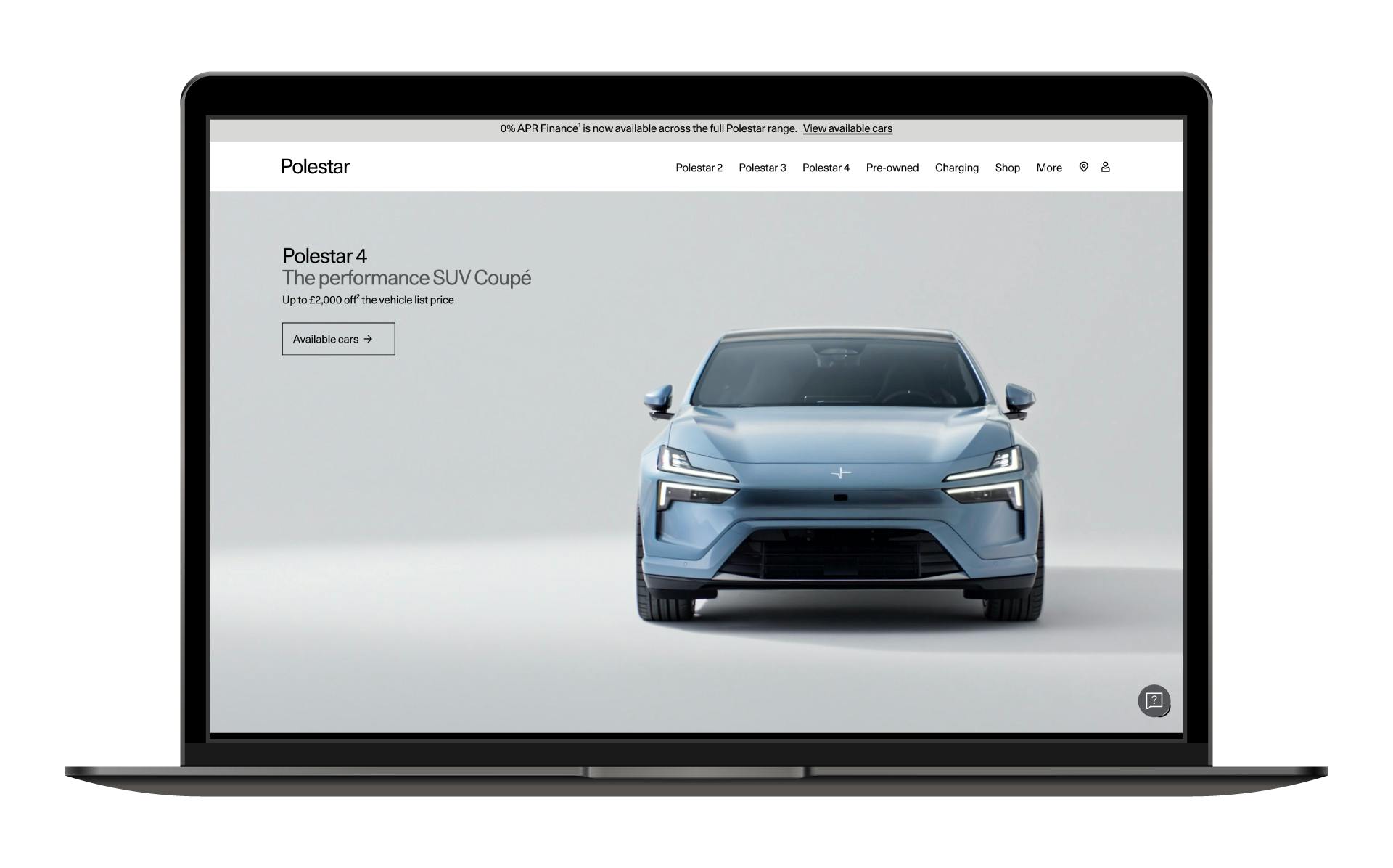
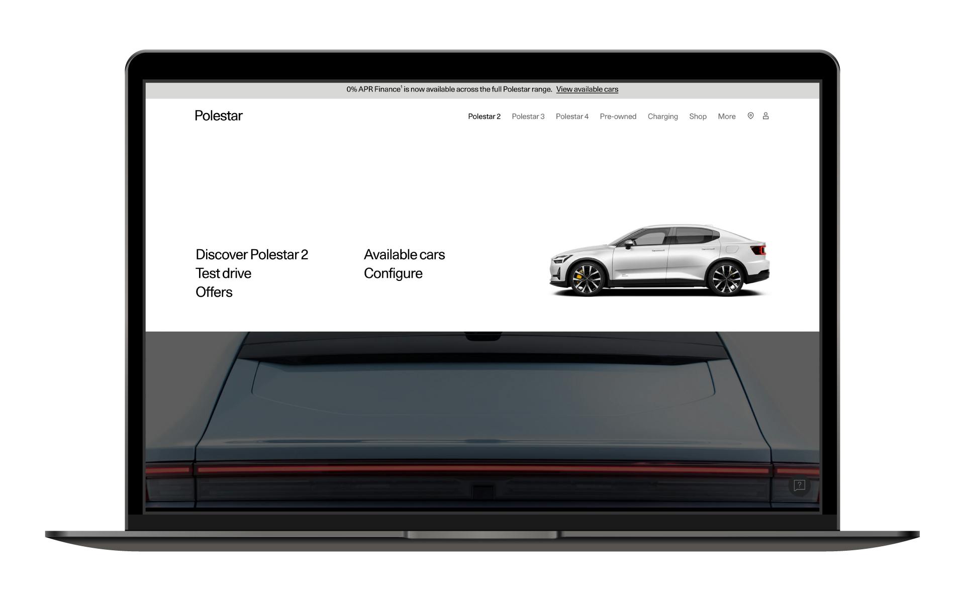
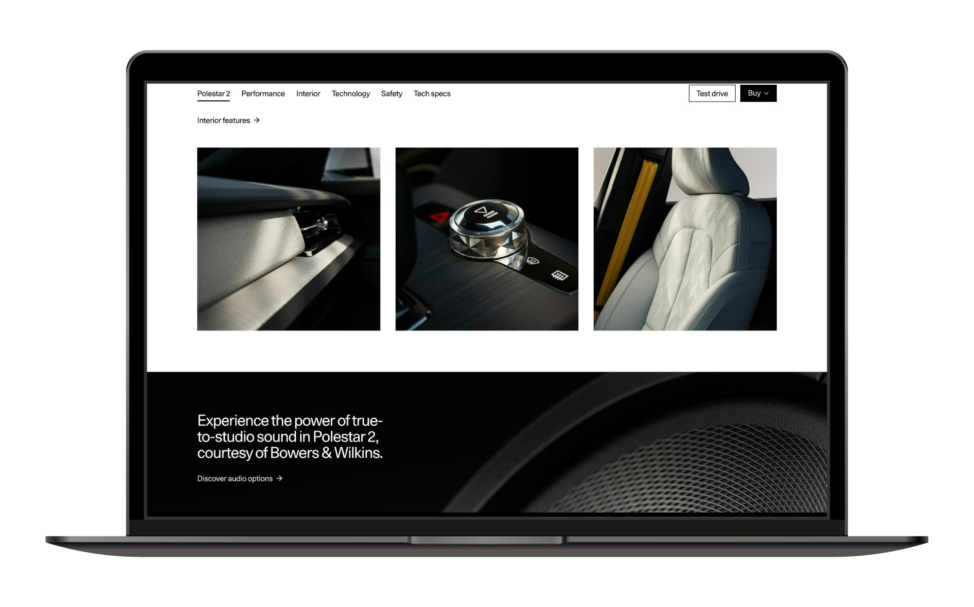
Every touchpoint on the brand’s website gives the user effortless control in a simple, cohesive, and fuss-free way. The result is a genuinely enjoyable, lightweight experience that removes friction and elevates the likelihood of purchase.
Make your brand effortless
Simple doesn’t mean lacking in style.
If you get your effortless brand right, you can satisfy more customers and reap big rewards for your business.
Whether you need a complete tech stack review or want to refresh your brand, we can help – call us on 01926 754038 or drop us an email at hello@designmc.org.
LET’S TALK
Looking to realign, refresh or redevelop your brand or business marketing strategy? Send us an email at hello@designmc.org or, give us a call direct on 01926 754038 for an informal chat.